

This is basically a mode in CSS. It basically helps to make a responsive layout of a website. It allows you to make out elements in a one-dimensional which are row or column, and it also helps to align the elements within the row or column.
Here is an example of how you can use flexbox to create a simple three-column layout:
.container {
  display: flex;
}

.column {
  flex: 1;
}
<div class="container">
  <div class="column">Column 1</div>
  <div class="column">Column 2</div>
  <div class="column">Column 3</div>
</div>
This will create a layout with three equal-width columns that are all aligned horizontally. You can use the justify-content and align-items properties to control how the elements are aligned within the container.
For example, you can use justify-content: center it to center the columns within the container or align-items: flex-end to align the columns to the bottom of the container.
In the above example, I was trying to explain with the example like how to make the elements inline and also this same concept we can always use for making the nav bars also the gap:abcPX; we can use to give the spacing between all the dives which are there in the class new,
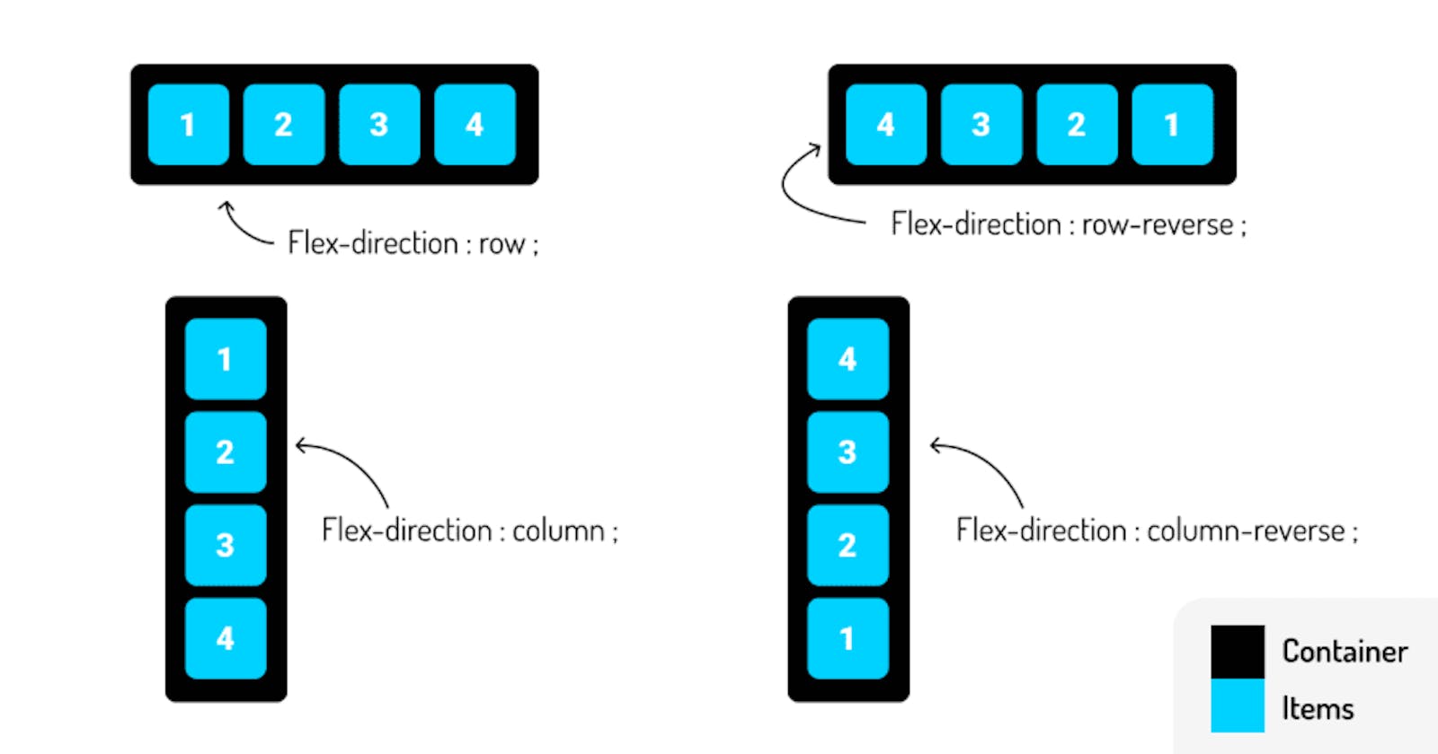
There is much more you can do with flexbox, such as controlling the direction of the layout (row or column), wrapping elements onto multiple lines, and controlling the size and position of individual elements. I'd be happy to explain more about flexbox or help you with any specific questions you have Just feel free to ask the question which is in your mind in the comments.